Saturday 14 May 2011

Evaluation Question 7

Looking back at your preliminary task, what do you feel you have learnt in the progression from it to the full product?
Overall, looking back at my preliminary task and my final products and pieces, I feel that I have improved most on my knowledge on computer programming and how to use colours, language and layout effectively for my coursework. On the prelim task I used Microsoft word to construct and edit my music magazine. However in this product I have managed to accesses a more advanced technology known as Adobe Photoshop. With this I had so many more options available to edit photos and text, etc. I also feel I have improved on my knowledge of codes and conventions for media and how they are used in the magazine industry. Doing more magazine analysis and reading over conventions in more depth.
Secondly I have improved using my camera. At the start it took me a while to get the right angle and lighting for my pictures. However in this project the knowledge come to me a lot quicker and with practise I got a lot better at using my camera and knowledge of lighting. I learnt more about editing the contrast and saturation of photos in order to make certain things stand out and draw the attention more of the target audience. Also the props used in my photographs related to my audience a lot more accurately and were a direct mode of address to the readers that the magazine was about the Dubstep genre. (See my folders for these photographs).

Evaluation Question 6

What have you learnt about technologies from process constructing this product?
Whilst I was creating this product I learned a lot of information on many designing websites such as Adobe Photoshop, Macromedia Fireworks and Cinema 4D. I learned a lot of information on Photoshop when going through the process to create my magazine. Microsoft Word seeing as I am very familiar with this program as I use it for most of my work. However, I soon found whilst trying to design my draft that there are many limitations to using this program such as you can't edit photos very well on it and that things overall aren't very easy to move around and position etc. I therefore downloaded the trial of Photoshop. This benefited me very well as I could go into further editing to make my magazine more visually interesting as a product. For example my artist images appear to have a white background. To do this I selected round the artist in the image carefully then secondly inversed the select to the background, after doing that I turned the background white with the brush tool or I even deleted the background completely. Doing this means I can then use the image on any background as there will be no elements of distraction in the image and no existing background to the image will be shown.

As you can see on my from my first prelim task front cover to my music magazine front cover I have improved a lot on visual interest. On my prelim task I used Microsoft word on all of this and didn’t have access to Photoshop. However on my music magazine I did have access. This therefore improved my editing skills and I could go into further skill and techniques to improve my magazine covers. For example the text is alot harder to see on my prelim magazine front cover as the background is busy and full of different shades of colour. However on my music magazine front cover i have removed the background around the main image so the text is 100% visible with no elements of distraction. I also learnt about pixelating images and making them fit perfectly on the page so that it didn't stretch the pixels. This was some of the main feedback I got on all my pieces about how the images seemed pixelated. This was because I had set the dimensions for the Photoshop page too big compared to the photo dimensions I was trying to put on there. This was something I never knew about before so this will probably come in handy in the future to know.

Evaluation Question 5

How did you attract/address your audience?
I have designed my product to appeal top my target audience in many ways. Firstly I have used informal language to appeal to the younger audience (14-25). As a lot of my target audience will be students and teenagers middle class and working class they will be used to reading information informally. This would therefore be more comfortable to them. Secondly the main image and other images used in my magazine show a dubstep artist ages 18. This music artist is a similar age to the audience, therefore this would make the audience feel more comfortable and involved with the magazine as the artist is liked the reader.  Thirdly on my magazine front cover I have used puffs like “Win an £15 ITunes voucher” to attract the younger audience to the magazine. ITunes has become very popular over the last 5 years and is used a lot by college students and teenagers. Therefore offering them a free voucher would be suitable for this situation. Also Dubstep is a new genre to the world today. It has become popular with the younger male audience all over the world. Therefore Dubstep seemed a suitable genre of music to feature in my magazine and to attract my audience. As Dubstep is listened to more by the male audience I then decided a masculine colour scheme used in my magazine would then make the male audience feel comfortable and not embarrassed to read the magazine. Also on my contents page I have used a student style layout and design to attract my audience. For example I have used crimpled paper as a background with post-it notes as the article space. I did this as a lot of students will read my magazine and therefore this will fit to their study lifestyle. Lastly the article on my DPS references to a lot of teenage dreams. For example I told a story of an artist on how he become famous making the music he loved. This is an everyday teenagers dream as they want to become “Super Stars”. This would therefore get the readers excited and involved with the magazine.

Evaluation Question 4

Who would be the target audience for your media product?

My core target audience would be a male audience ages 14 – 25. I gained the exact right information that would help along the development if my music magazine. From the results the target audience was ages 14 – 25 of the male gender. I kept the colour scheme masculine and bold so the male audience would feel comfortable reading this and not feel embarrassed.

The Dubstep genre evolved from other genres of music such as UK garage and drum and bass. Therefore other groups of people may look into my magazine and buy it as the genre is closely related to others.
All these genres are very popular in the 14 – 25 age groups. Therefore amongst the teenagers there interest would be shared and also be very familiar.

Dubstep started getting popular around late 2009, early 2010 and according to my research a lot of teenagers listen to Dubstep all around the globe. And Dubstep artist range from aged 16 - 25 Therefore the 14- 25 age group its perfect for this magazine and is the ideal audience to present this to.

Evaluation Question 3

What kind of media institution might distribute your media product and why?

For my magazine I think that either a large media institution that covers a lot of music genres such as drum and bass and Dubstep will distribute my media product. For example “Ministry of sound” would be a perfect media institution to distribute my product. Firstly they are one of most popular media institutions around the globe and focus on a wide variety off genres of music. Such as drum and bass, Dubstep, techno and many more dance genres. This would therefore be a suitable media institution to publish my magazine as it’s of the Dubstep genre and my magazine cover references to music what the ministry of sound have produced.
Other larger labels such as UMG (Universals Music Group) have publishing rights all over the world. Therefore this would be able to reach a wider target audience. This would then create synergy between the magazine and media institution as two companies combine to create a finished product. The finished product would be the music magazine and the media institution “UMG” or Ministry of Sound” will sponsor and distribute the magazine.

Evaluation Question 2

How does your media product represent particular social groups?
My magazine represents mainly the younger audience ages 14 - 25 mainly males who are middle/lower class

I priced my magazine at £2.99 which would represent to the younger audience as college students/ teenagers do not have a lot of spare cash.  Also people who listen to Dubstep would be stereotypically described as middle/lower class people. £2.99 was the common price which people would be willing to pay according to my questionnaire.
The name of my magazine was a direct mode of address to the genre of music “Dubstep” as a lot of Dubstep artist compete to get the best “drop” , its also easy to pronounce and quite snappy. This made the name memorable as possible, “TheDrop” and would be remembering by teenagers and college students. Secondly Dubstep is more listened to by the male audience so therefore I took a masculine approach to the magazine. I did this by using a taking a masculine colour scheme “Black and white” and using it throughout the magazine. The main image is a male Dubstep artist and he is used throughout the magazine. He is around the age of 18 and a lot of teenagers today idolise male artists and therefore is good approach to present him on the magazine. The fact he is presented in casual clothes may invite the readers into the magazine as the readers may feel they are similar to him and would therefore be involved deeper with the magazine. I also used emotive language such as “Exclusive” and “best” to draw teenage people into the magazine as they would want to be the first to know the music news.
The language used was quite relaxed and informal also I used bold eye-catching fonts to direct the reader around the magazine which makers it easier to understand. The magazine on the contents and front cover is easy at quick to read this then prepares them for the main article as a lot of college students to not have the time to read a lot of text.

Evaluation Question 1

In what ways does your media product use, develop or challenge form and conventions of real media products.
How I used them…
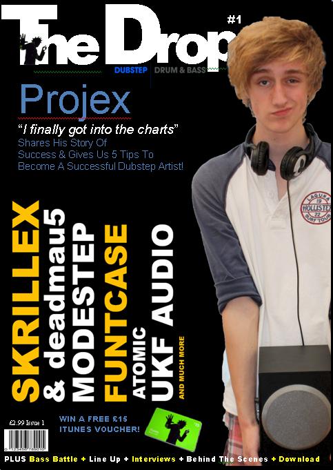
I designed my logo for my magazine so that it conformed to the normal codes and conventions, as most music magazine have a bold title with sometimes it going slightly behind the main image or another feature. This is normally a sign that the magazine is already well recognised which is why I did it to my magazine, as well it meaning that it is using the conventions. Secondly my music magazine front cover also contains an image which follows the similar layout, shot type and structure of a lot of other music magazines. My front cove has a main headline quote to focus on “I finally got into the charts”, I found included in a lot of music magazines today.  Thirdly my cover uses puff’s such as “Win a £15 iTunes voucher”. In a lot of music magazine today they will have music industry related puffs or festival tickets. My contents page uses the typical feature of “exclusive” text to lure the reader in to the magazine and read further on.  Lots of “DJ” magazines always use the phrase “Exclusive artist”. This then makes the reader feel special that he is finding out about exclusive information. My double page spread uses an eye catching bold font as the main article heading. This is then a direct mode of address to the viewer the article is about a certain genre of music. My front cover, contents page and double page spread all use images relevant to the genre of music. For example the image on the front cover is a artist holding a sub-woofer. A subwoofer is what makes Dubstep and its what emphasises the sounds of Dubstep. Therefore if the reader saw this they would instant know the the magazine is about a bass genre such as drum and bass or Dubstep.


How I challenged the conventions…
My main image overlapped the masthead. This is because the main image appeared stronger and more dominant the masthead itself. The image is a direct mode of address that signifies to the audience the magazine is about Dubstep. Secondly I rotated the “Artist titles and incentives” 180 degrees so they appear down the side of the page. This is a different approach to present text as a lot of music magazines have then cover lines and headlines straight on the page. Therefore it gives the cover visually interesting. Also it also points to the main picture so the viewer’s eyes read the cover line and then their focus is brought to the main picture.
How I developed the conventions.
On my front cover, DPS and contents page I have used different designs throughout. The colour schemes vary a bit but, along it’s the same lines. This makes the magazine more visually interesting and each new page is different and therefore excites the viewer and there’s always something new for the viewer to explore. However I have used the same artist image throughout the magazine as the main article is about that artist. This will intrigue the viewer throughout the magazine leading up to the DPS as the readers will want to read about the artist.

Friday 13 May 2011

Final Double Page Spread

Here is the final double page spread for my music magazine.

Final Contents Page

Here is the final contents page for my music magazine.

Final Front Cover

Here is the final front cover for my music magazine.

Layout Of Music Magazine Double Page Spread

hese pictures show an initial idea of how I would like my double page spread to be laid out, with the generic conventions of a double page spread featured, such as images of the artist featured,, pull quotes etc. However this may change according to text size and image quality.

Layout of Music Magazine Contents Page

Here is a screenshot of the layout of my contents page. This layout appears more visually interesting than basic straight text. So i have out some text on a slant and placed images on a slant. The use of main image at the bottom portrays to the audience the articles are about him or to do with that genre of music.

Layout of Music Magazine Front Cover

Here is a general layout of how I would like my magazine front cover to look, with the generic conventions that would be placed on the cover, such as main coverlines, the masthead, the puffs and things like the barcode, price/date etc.

Music Magazine Front Cover Analysis


The artist on this magazine front cover is represented in many ways. Firstly his facial expression suggests a lot about his personality and music genre. He appears to be shouting the word “ColdPlay”. This then links to the Headline “Barking The Secret World Of Chris Martin”, this could suggest he is like a dog and a dog is controlled by someone. He could maybe feel under pressure to share his feelings and talk about his life. Also the aggressive bark could link to the genre of music and suggest Coldplay have an aggressive side to them. A medium shot of the main image reveals his facial expression and the top half of his body. The reader can then identify his clothes and also the look on his face.

“Q” magazine holds a similar structure and layout on all their magazines. The big Q at the top right is on every magazine they have done.  This acts as their mast head, and then next to it is the main image that takes up the rest of the magazine page. The big Q attracts the main attention to the magazine. If the viewers see the Q they instantly known it’s that type of music magazine. On this magazine cover lines are spread out. This could link to the main image that his thoughts are all over the place and he can’t thing straight. This magazine also features and follows generic structures on all types of magazines such as bar codes, cover lines, date, seal of approval etc. The only thing that is different and stands out from this magazine is that the main headline goes over the main age’s mouth. This then represents he is shouting the text as it’s in a bold eye catching font.

The colour scheme for this magazine is fairly masculine. Firstly the black jacket symbolises that the artist has a punk rock side to him and maybe a dark side. This then links with the cover lines as he is not sure about himself and quite insecure. The dull coloured background emphasises the main image and brings that the viewer’s main focus. The white text stands out from the dull background and the black jacket. This is the audience’s second attention and they can then look at the image and learns about his body language and then read the cover lines and incentives.

The language features on this magazine are informal. It is very straight to the poit and out there. For example “I thought I was gay”. This cover line is very straight to the point and then the reader can instantly tell that the artist is not sure and insecure about himself. Secondly the language on this magazine could appeal to the older audience as it states sexual language and preferences and the language could appear offensive to some people.

Due to The language and cover lines stated on the front cover and the colours are quite dark and dull. I would say the target audience would be men ages 16 – 25 where as other issues could be for older and younger audiences. However the fact that cold play is listened to and viewed by both the male and female audiences this magazine is also targeted at females as well.

Double Page Spread Analysis


Contents Page Analysis

Monday 9 May 2011

Music Magazine Photoshoot


Planning The Photoshoot

As my magazine is of the dubstep/dance culture I looked at magazines such as “Woofah” and “DJ” magazine to see how they portrayed male artists as the model on my front cover will be a male DJ. I noticed that when they have male DJ artists on their cover its wither a action clubbing shot of them or a medium close of them, revealing facial expressions and part of the background and also the main focus of the cover.  For example in “Woofah” magazine this shot of the artist is a medium close-up revealing the top of his clothing,  part of the background and importantly his facial expressions.
Therefore on my double page spread my male artist will be wearing DJ headphones whilst on a laptop playing a song. This will give the audience a direct mode of address that he is DJ due to the equipment he has. Also on the double page spread I will use a close-up shot of the artist creating a more personal feel. This will then link with the article placed next to the image as that speaks about how he started off as an artist. On the front cover of my magazine I will use a medium long shot of the artist holding a sub-woofer also with a smug smile. This again gives the audience a direct mode of address that he is a DJ as a sub-woofer is the main part to that genre of music that people enjoy. Also the smug face could come across as a bit cheeky and show confidence to the reader.
On the contents page I used a medium shot of the artist holding a sub-woofer on his shoulder pulling a wacky pose. This could link to the clubbing lifestyle and suggest the artist is a bit bonkers and could then relate back to the music genre. Lastly with the artist costume is a casual laid back style. This then tells the viewer this genre of music is not formal it fits to the party lifestyle. Lastly a lot of drum and bass artists and dubstep artist have crazy hair. Therefore I got my artist to make his hair crazy to create a direct mode of address to the audience that he does fit the dubstep/ drum and bass genre.
Overall the magazine should have quite a casual feel to it therefore the photoshoot shouldn’t be too structured. All of the images relate to the genre and look natural.

Copy Of Magazine Cover


As part of our coursework task we were asked to remake a music magazine front cover.  When I was looking for a magazine I knew straight away that I could cop Beastie Boys magazine because me and my friends are big fans.
Before I took my photos I made the background, masthead and cover lines using adobe Photoshop cs5 extended. As this magazine is fairly old the font styles were not that difficult to get my hands on. I managed to find the “Smash Hits” logo and the other fonts were wrote in “Arial Black”. This cover is fairly basic as it’s not a magazine published today so there are not many graphic features shown on this magazine apart from the main image and different colour  cover lines and incentives. The layout of this magazine follows the guidelines and qualities of a lot of magazines with the masthead at the top, man image to the centre, cover lines surrounding the image and a seal of approval.
Taking the photograph itself was fairly hard. It took me a good 10 attempts to get it perfect and even still I had to crop it again. I used a medium longshot to capture this photograph. This then leaves space to view part of the background and still reveal the persons facial expressions and part of their clothing.  To edit this I then used adobe Photoshop cs5 extended. Using the select tool I carefully went round every person individually until they wer perfectly selected, then I inversed the select so the background was then selected.  I then changed the background to a red colour as this its what’s on the original magazine. After doing this I neatened the photo around the edges and as one of the artist on the magazine was wearing a “Fila” t-shirt o inly had a white t-shirt. There for I had to copy and paste a logo of the internet and rotate and transform it to fit on his t-shirt. This then appeared very effective and successful.
Overall I’m happy with how the remake came out but I I were to do it again I would choose to take the photograph next to a green screen or a lot less busy background. Secondly I would probably take the photograph before making the layout to make the procedure accurate as possible.

Analysis Of Questionnaire Page 2


Analysis Of Questionnaire

These are my questionnaire results. All this results provided me to make accurate decisions on what my target audience wanted. I used the information they gave me in a positive perspective and will use this to construct my music magazine front cover.